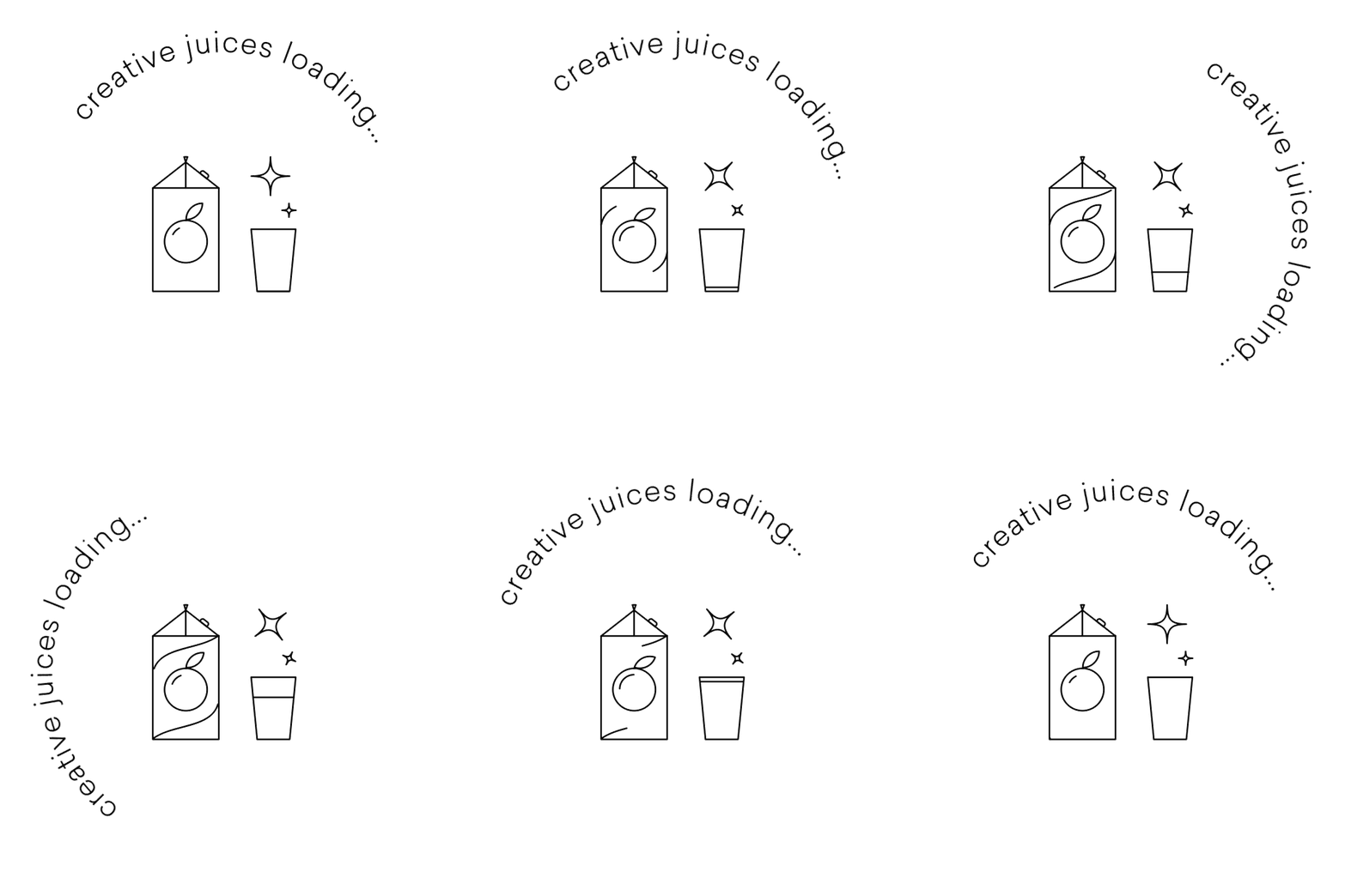
“I begin with an idea, and then, it becomes something else.”
– Pablo Picasso
Behind every great brand are an idea and an experience. But, in today’s competitive business world, it takes a whole lot more than an idea and service to stand out.
There’s no longer any doubt whether visual design and identity have transformed how brands are activated within the consumers’ minds.
In fact, building a visually-recognizable brand is non-negotiable, with more than 90% of consumers making decisions instantly based on the visual identity.
Today, with an entire generation of active market participants waiting for their visual cue to connect with a brand, the intrinsic value of visual identity is more than recognized.
Without further ado, let’s go over the five key visual identity elements that can help you engage with consumers at different points of their journey.
What is Visual Identity?
Visual identity refers to the visual elements that are used to represent your brand. Think about your brand’s logo, color palette, typography, imagery, and other design elements.
The visual brand identity helps to establish the brand’s visual persona and create a cohesive look and feel across all of its marketing and communication materials.
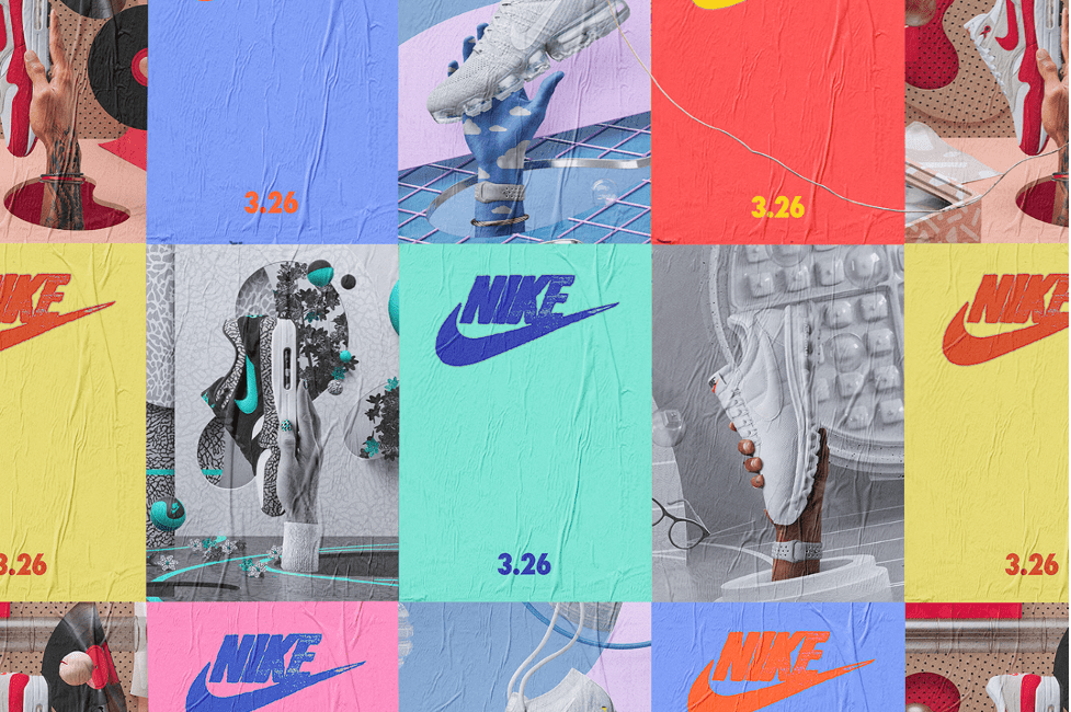
A powerful visual identity can help you build recognition and credibility for your brand and differentiate it from the competitors within your industry.
There are many examples of memorable visual brands in the business world. Just think about some of the most recognizable:
- Coca-Cola: Known for its distinctive red and white color scheme and its classic script logo, the brand also uses a wide range of powerful visual elements, including vintage-style imagery, to create a nostalgic and timeless feel.
- Apple: Characterized by its simple and clean design aesthetic, reflected in its minimalist logo and packaging, this is a brand that uses a consistent color scheme of white and shades of gray, which helps them create a sleek and modern look and feel.
- Nike: A visual brand identity characterized by its iconic swoosh logo, which has become synonymous with the brand. Nike also uses a consistent color scheme of black, white, and shades of gray, which helps them in creating a strong and cohesive look and feel across all of their branding materials.
- McDonald’s: McDonald’s is known for its bright red and yellow color scheme and its iconic golden arches logo. The brand’s visual identity is designed to be bold and eye-catching, helping them stand out in a crowded market.
- Google: Google’s visual brand identity is characterized by its simple and modern design aesthetic. The brand’s logo features a multi-colored letter “G,” which has become iconic and is instantly recognizable to many people around the world.
Creating a powerful visual identity is about ensuring that each visual element supports the other across every marketing material.
Moreover, it’s about making sure that the elements create an accurate depiction of the brand’s personality and the value you bring to your target customers.
Now, let’s talk about the most important ones that you need to pay attention to.
1. Logo
Logo is the heart of visual branding design. It is the principal symbol of any brand, providing multiple information about the graphics, imagery, color and typography choices that propel your brand forward.
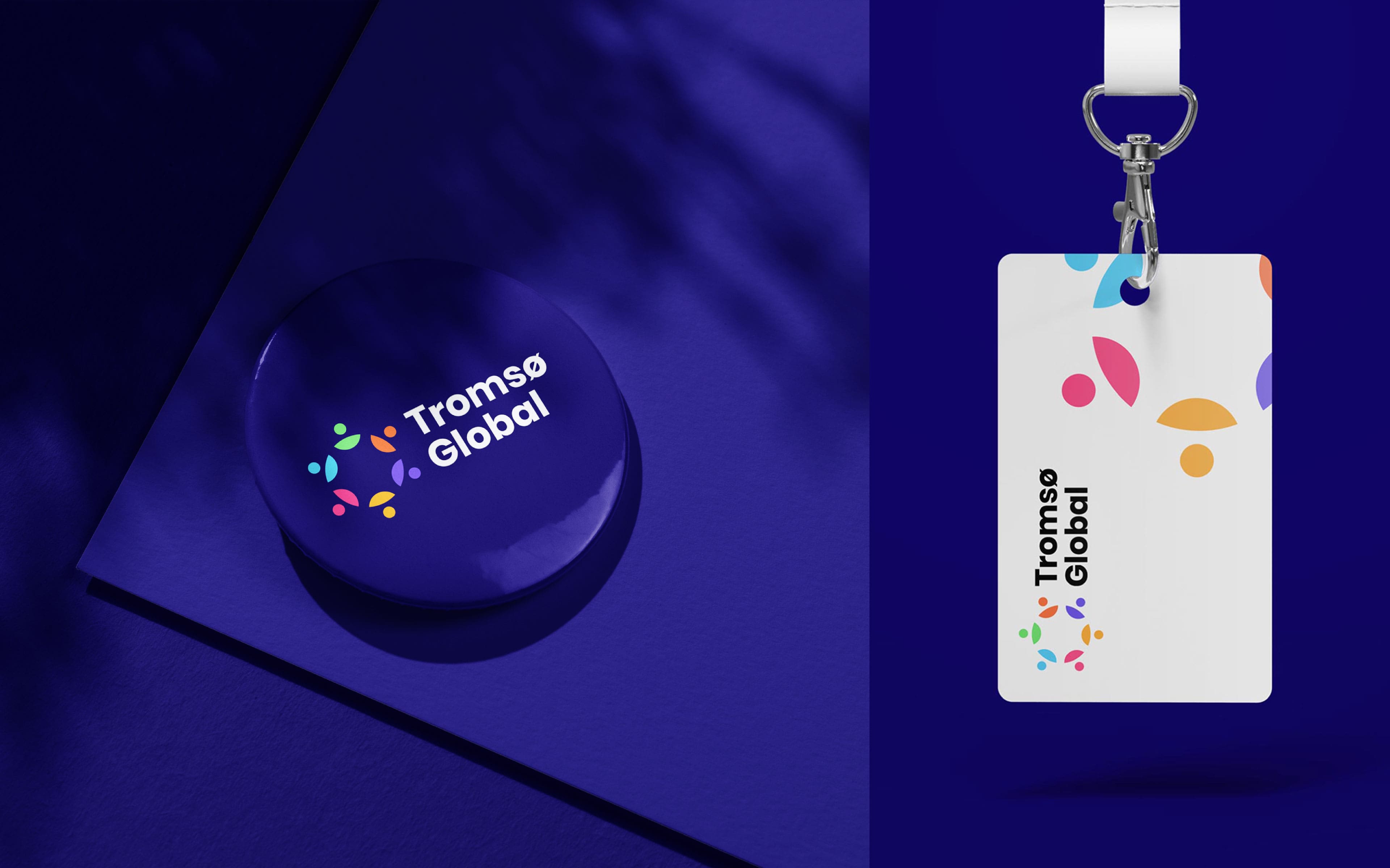
Regardless of the type of logo you want for your brand, the most important aspect about it is that it should help convey your visual identity. Ideally, the logo should communicate what your brand message represents in plain visual terms:
- Color: The colors used in a logo help the logo stand out or blend in with its surroundings.
- Typography: The font or typeface used in a logo can also convey different meanings and associations.
- Shape: The shape of a logo can help to make it more distinctive and memorable.
- Graphics: The imagery used in a logo can be anything from a simple graphic element to a more complex illustration.
Overall, the visual aspects of a logo are an important part of its design, as they help to create a visual identity for the brand and communicate its values and personality to its audience.
2. Color Palette
The color palette is an important part of a brand’s visual identity because it can help you create a consistent and cohesive look and feel across all materials, and can also help you convey the brand’s personality and values.
A brand color palette typically includes a primary color, which is the main color used to represent the brand, and one or more secondary colors, used to complement the primary color and add variety and depth to the brand’s visual identity.
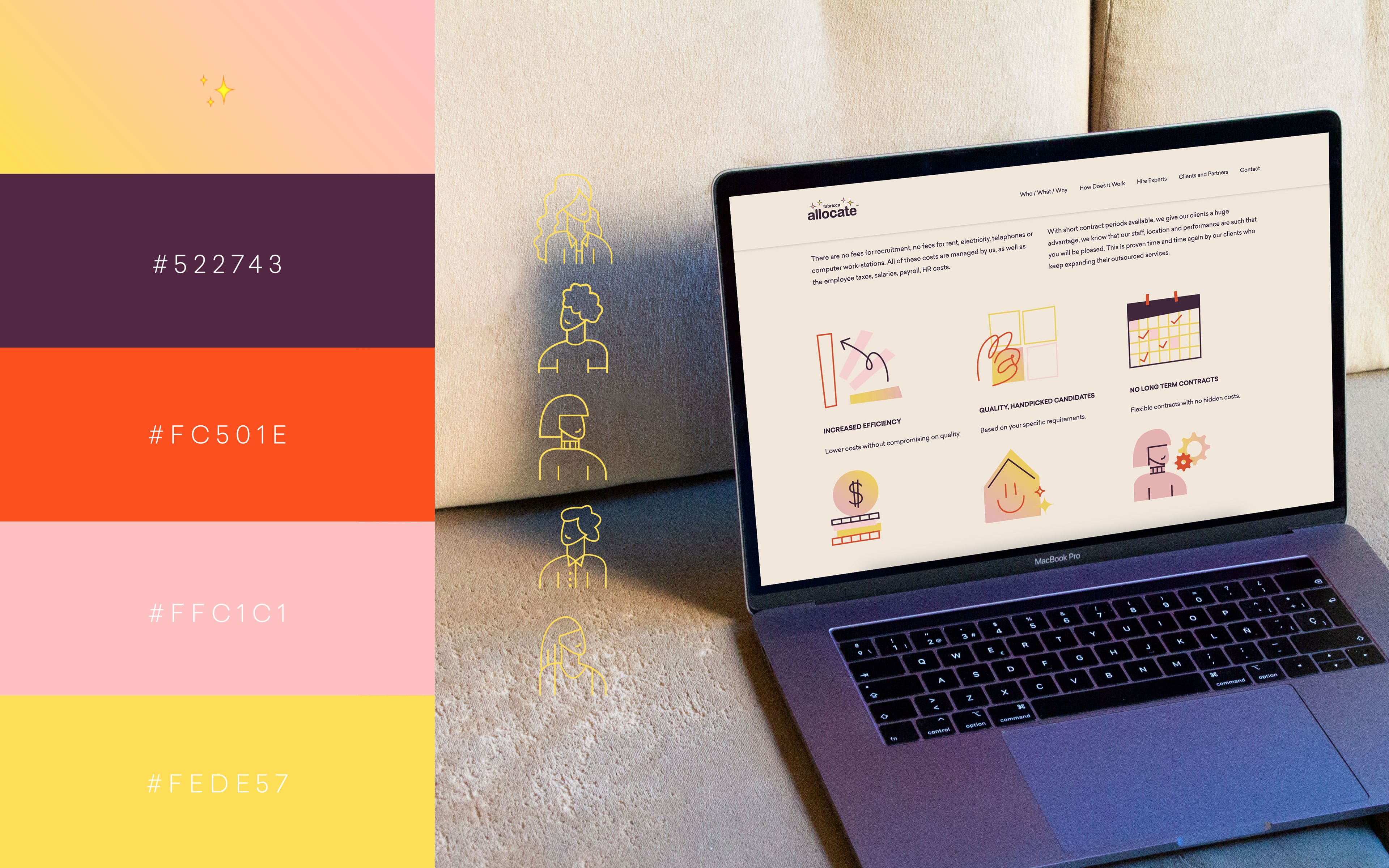
It’s important to choose colors that are appropriate for the brand and its target audience, and that work well together in a variety of contexts for your brand.
It can also be helpful to consider the meanings and associations of different colors, as these can have an impact on how the brand is perceived by its audience. For example:
- Red: Red is often associated with strong emotions such as love, passion, and anger. It can also be associated with danger, excitement, and power.
- Orange: Orange is often associated with warmth, enthusiasm, and happiness. It can also be associated with caution and affordability.
- Yellow: Connected with happiness and cheerfulness. It can also be associated with caution and cowardice.
- Green: Connected with nature and tranquility. It can also be associated with money and jealousy.
- Blue: Blue is often associated with trust, reliability, and calmness. It can also be associated with sadness and coldness.
- Purple: Purple is often associated with creativity, luxury, and mystery. It can also be associated with royalty and spirituality.
What the above tells us is that color is critical for whether the potential customers like and trust your brand. It’s important to consider the associations of different colors when using them in branding and design, as the choice of colors can have a significant impact on how a brand is perceived.
3. Graphics
The rest of the graphic visual elements act as extensions of your entire visual brand.
This includes everything, from simple lines and shapes to icons and forms that have unique functions within your marketing strategy. For instance, on your website, each icon and button might represent a separate visual interaction with your brand.

Graphics and illustrations are often used to supplement or clarify written or verbal information, and can help to make complex ideas easier to understand.
There are many different types of graphics and illustrations that can be used in design, each with its own unique characteristics and uses. Some common types include:
- Vector graphics: Vector graphics are created using mathematical algorithms and are resolution-independent, meaning they can be scaled up or down without losing quality. They are often used in logos, icons, and other design elements that need to be resized frequently.
- Raster graphics: Raster graphics are made up of a grid of pixels and are resolution-dependent, meaning they can become pixelated or blurry when resized. They are often used for photographs and other images with a lot of detail.
- Infographics: Infographics are visual representations of information, data, or statistics that are designed to be easily understood and absorbed. They often use a combination of text, images, and charts to present information in a clear and concise way.
- Illustrations: Illustrations are hand-drawn or computer-generated images that are used to depict people, objects, or scenes. They can be used to add visual interest or to convey a specific message or idea.
Overall, graphics and illustrations are an important part of visual design and can truly help you communicate information and ideas in a clear and engaging way.
4. Imagery
The old adage “An image is worth 1000 words” will ring true forever, and for all the right reasons.
Imagery is a branding element that helps you to visually communicate your brand’s message and values to your audience. It includes any visual element used in a brand’s marketing and communication materials, such as photographs, illustrations, graphics, and icons.
Using appropriate imagery in your branding efforts allows you to construct a cohesive and consistent visual identity, and communicate specific messages and emotions to your target market.
For example, if your brand focuses on sustainability, you might benefit from the imagery of nature and eco-friendly products. On the other hand, if you want to target a youthful audience, you might want to use energetic and modern images.

Choosing imagery that is relevant to your target audience and aligns with the brand’s overall messaging and visual identity is essential.
Imagery can also be used to differentiate a brand from its competitors and to create a strong and memorable brand experience.
5. Typography
Often overlooked, typography is involved throughout the entire visual branding process in literally every aspect, such as the logo, product packaging, website, documents, and social media materials, all of which include a great deal of typography.
Typography makes your branding messages legible, and defines the information that consumers experience from your brand. Moreover, it influences perceptions, building greater brand recognition in the process.
Again, think of popular brands such as Disney that became iconic with their typefaces and visual identities. It is unique, memorable, and covers all the branding touch points.
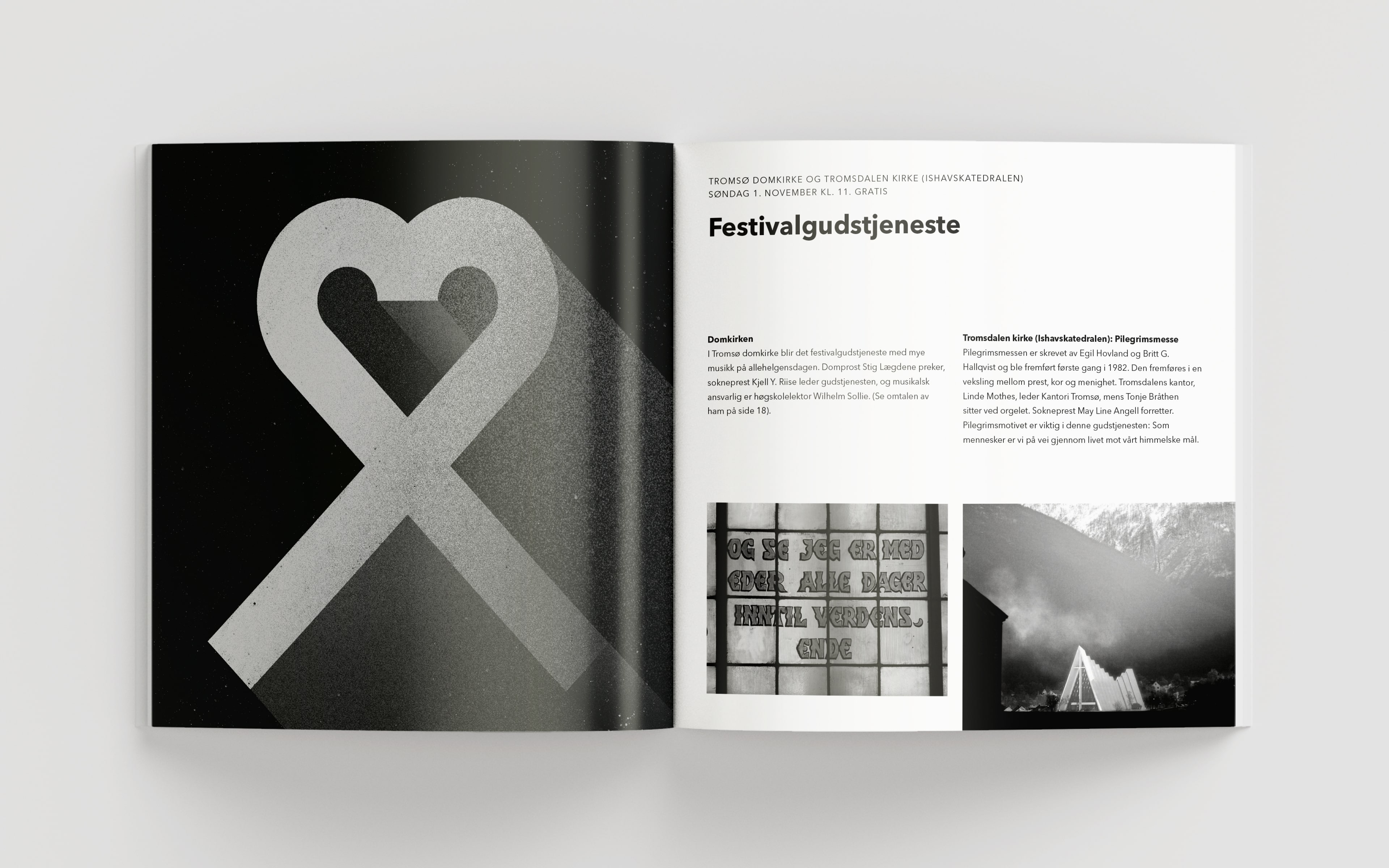
Think about your own brand and audit the typography that you’re using, or plan to. Here are some tips for using typography effectively in visual branding:
- Choose a font that aligns with your brand‘s personality and values. For example, a formal or traditional brand might choose a classic serif font, while a modern or playful brand might choose a sans-serif font.
- Use a consistent font across all of your branding materials. This helps to create a cohesive visual identity and makes it easier for your audience to recognize your brand.
- Pay attention to font size and hierarchy. Use different font sizes and styles to emphasize important information and guide the reader’s eye.
- Consider using color to differentiate different types of text. For example, you might use a different color for headings, subheadings, and body text.
- Use legible and easy-to-read fonts. While it can be tempting to use unique or decorative fonts, they may not be as readable as more traditional fonts, which can make it harder for your audience to understand your message.
- Avoid using too many different fonts. Using too many different fonts can be overwhelming and make your branding materials look cluttered and confusing. Stick to one or two fonts for maximum impact.
Over to You
From colors, to typography, images, and logo, your brand’s visual identity is pivotal to how your target market perceives what you do.
By combining the key visual branding elements and best practices above, you can start creating a memorable visual identity today.
However, remember that we’re talking about an ongoing process that can take several fine-tuning iterations for reaching what feels like a solid brand identity.
If you are struggling with that process, talk to us! Visual brand identity design is our professional expertise, and we enjoy working with clients that want to reach the top of their industry by building a distinctive brand.
Our team of experienced designers has a proven track record of delivering high-quality visual design that helps our clients stand out in their industries and attract new clients.
We work closely with our clients throughout the design process to ensure that the final product meets their expectations and effectively communicates their brand message.
Check out what we do, and let’s get started together!
